Sunday, November 4, 2012

517 Old World Dining

The piece here sits in our client's gorgeous dining room designed by Jennifer Flanders of New York
Showing in background is our sideboard in a Gustavian finish of dark ivory and robin's egg blue.  The room will get one more piece of furniture designed and built by us (not shown at current time).  


This is a very rustic dining table with pullout breadboard ends, and two leaves.


Showing Breadboard end.


Measuring 54x98 it will seat 8 comfortably with no leaves in place, and will expand to 134" long (11 ft) to seat 14 with both leaves in place. 


Close view of end.  Since the table is so large, it was built to disassemble easily.  Hidden behind this rectangle is a lag screw which attaches the trestle ends to the stretcher at the floor.  


It has a hand planed surface and wears our popular  "living finish" because it is easy to live with, looks natural and alive, and will age beautifully without needing any protection from place mats or coasters. 


 It is a distressed, durable and easily repairable penetrating oil finish which gives the table a very authentic looking antique look and feel.  Shown here are square pegs at joints of top, and "worm damage".  
Another close view of top showing "cracks" and square pegs and distressing marks.  


Underneath one of the breadboard ends is this beautiful inscription in letters about 2 or 3 inches high.   The parents plan to hand this table down to future generations. 


Saturday, August 11, 2012

513 / 185 Built in bookshelves and bench are made match house's natural fir trim

These beautiful natural fir cabinets were original to the house.  The house belongs to a busy family with small kids who like to set the table.  Not only were some of these glass panels cracked but the leading was, of course, toxic when rubbed.  We rebuilt the panels using old window glass and artificially aged zinc came to mimic the old work.
On the other side of this large room, it is evident that while the bookshelves are fully and neatly stacked, there isn't quite enough storage for the family.  (Before photo)
This "after" photo shows the built in cabinetry and bookshelves made to match and blend with the existing house woodwork.  Buck and I designed the unit and built all the components.  Our friend and colleague Jeff Axtell installed our work.
You can see that the neighboring house got a new coat of paint during the time it took to do this project!  
Here are two sturdy drawers (one for each child -- smart!)  A cushion is planned for the seat.  

Drawers were self guided, similar to others in the house, and well waxed so they work smoothly.  
The corner of the bench is fitted with a block similar to the detail on the glass fronted casework.

In order to save space in this rather modestly sized bungalow, the deepest / largest books were given a shelf above the bench.  It is deep enough for the large volumes and still easy to reach these while standing on the bench top. 
This shows some details of how the bench section meets the shelf sections, and the understated crown at the ceiling level.  All the pieces were built in the shop and pre-finished.  Installation therefore consisted of very little on-site disruption and took one guy and a helper 1 1/2 days.  

Detail of how the bench sides meet the bookshelves.  Many hours of design time and thought went into what exact configuration and dimensions were best for this entire structure.  Bench sides were designed so that these long broad planks would serve as back rests.  All work is done to look like solid wood; however plywoods were used where appropriate.  Solid wood expands and contracts seasonally, and if a piece is built wrong, or if solids are used where plywoods should be, these solids will warp, crack and split.    

Another view of the drawers. 
Another view of the bench backrest.  (Pillows made by yours truly)

Showing nice tight joint between the case and wall.  Special thanks to our friend and colleague Jeff Axtell, who did a brilliant job at installation while recovering from a fractured collar bone.

This is my favorite feature:  Old school zig zag adjustable shelf supports.  I love these but my husband considers them a waste of time.  Therefore it is usually my job to make them.  Fortunately he has made us a very clever jig that makes the cutting nearly automatic, and it also makes it fit precisely, such that any support will universally fit into any slot.  


Sunday, April 29, 2012

494 Giant Floor Mirror

Here is an extra large floor mirror designed by Cecilia Kruse-Wright of Portland, and displayed in Cecilia's room at Bedford Brown.  

Showing basic shape -- This particular mirror measured 84 x 90 inches overall, and can be ordered in any size or configuration.  

Close detail of finish, which was meant to look very old and with a Swedish feel.  The  piece has therefore a modern look  but with an aged finish giving it an antique with modern feeling which will work in any interior scheme. 

Close view of gilding and creamy grey paint, showing subtle crackling.  See antique effects on the mirror as well.  


Saturday, April 28, 2012

500 French Provincial Dining

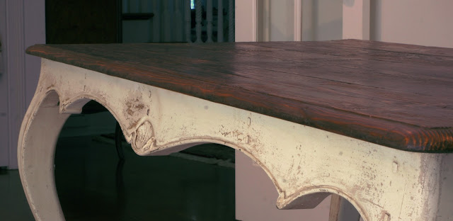
A bespoke design for a local Portland family - we designed and built this cabriole dining table to go with this set of chairs.  A lot of our clients are taller than average, as were the people in this family.  They wanted plenty of leg room, and so the overall height of this piece is 1/2 inch higher than standard, and the apron height was chosen carefully to look proportionate but provide plenty of height.   
This was the inspiration piece; however, this table was built with the intention to exactly duplicate the design shown on a pre-existing photo.  In the end, I was unsatisfied with the awkward way in which the legs joined the apron. 

This design is, to my eye, a vast improvement over the table shown above; the apron on this one slants slightly outward at the bottom and therefore transitions into the leg seamlessly.  


This is reclaimed douglas fir from an old Oregon barn; it was stained dark and given a good dose of wood hardener and lots of penetrating drying oils as a "living" finish. 

This detail on the apron was meant to imitate or blend with the details on the chairs.  Scalloped beads are meant to evoke the classic French Provincial furniture treatment  

View of side apron, showing hand carving and the gently slanted apron.  

I was very pleased with these legs, and used this opportunity at re-designing to also re-work the leg curves.  

Showing corner where leg and apron meet.  Square pegs at the joints provide extra texture. 

Showing distressing and carving texture.  

Side apron and leg detail. 

End apron detail.  


Sunday, February 19, 2012

248 / 391 French country scroll base breakfast table

Here is a small solid pine dining table with a grey and white "whitewashed" finish of durable casein paint and a living finish.
This is a "before" picture of chairs, painted above.  This set of four chairs appeared on Craigs list and I added layers of greyish casein paint and a weathered finish.  

Another version of the same scroll based round table:  this one sits in a breakfast nook and is 40 inches diameter, but the table can be built in any size and in any species of wood.  This table "reads" creamy white at a distance, 

But the colors used are a variety of confetti shades, with the table's prominent stripes outlined in jeans blue.   
Showing highly eroded painted finish.  the raw pine in this case had plenty of large knots, but can be obtained in a quieter look, with smaller knots.


Close view of finish at table's edge.  We used a penetrating drying oil to give the raw wood protection and a living finish.  

As with all living finishes it is not necessary to protect the table with placemats or coasters, and the table will not develop rings.  It is never recommended to put a hot pan from the stove on the table without a trivet; however, all other normal kitchen wear and tear will not affect the piece. 

Close view of the table's base.  

Elevated platform on scroll base provides great foot room underneath the pedestal base.  

Another view of pedestal

A different paint color scheme

Close view of foot showing green / white / blue color scheme

Another view of foot

Close view of top showing severe erosion and distressing of surface